4.5.08

Final Major Project Wiki


For my Final Major Project I have created a Wiki that will catalog my progress through the research and development of a final product. The Wiki is a test drive more than anything else at this stage, it does however contain all my work up until this point.
To view work on the Wiki please follow THIS link. All my reasoning behind using the Wiki can be found at THIS link.

Thank you

28.4.08

RSS

I've discovered RSS. It's really rather good! I highly recommend it to anyone who hasn't given it a fair chance yet. With a good RSS feed manager, such as FeedDemon, you'll be flying! I currently use my feed manager to keep an eye on many things, even the news

15.4.08

Cyber Vandalism


An article on cyber vandals and Wikipedia. Talking about how their open editing website suffered from roaming data vandals. Click image to follow

14.4.08

Website Update


  • Theme: Further to my work from the end of the deadline I have reworked the theme of the website, which I feel gives the website a friendlier welcoming look now. However, the banner still needs much work yet, as do the fonts used in the navigation bars.


  • Live search: A feature that searches all posts, comments and pages for search words and displays results as you type. Well why not?


  • Footer: In response to the contact details not being found with ease, I have relocated the best contact methods to rest on the footer. Along with this I have also added some basic copyright claims and link to my author.

7.4.08

Final Website View


These two images are to show what the website looks like for the purposes of marking without visiting the website in question. I would submit the website as a separate locally run collection of files but as the nature of website is PHP and MySQL driven it wouldn't run correctly and do the website any justice.


Although you can get a feel of the layout from these pictures, you cannot interact with the website so I hope you will visit the website itself at www.fooddreckly.com

Thank you!

Evaluation

While this project was a complete success in both furthering my understanding of back end server management but also in creating a stable and long lasting website I do however understand that it's not entirely completed as far as meeting all the brief requirements set by the client goes.

The website may well have all the functionality it needs to do it's job at this time but does lack a heavier image use that could otherwise help make this a lot more appealing to potential customers.
Due to the bandwidth restrictions of the web host we have been very careful with the images used so as not to push the server limits, I do feel though that the website would benefit greatly from a more media heavy style and will be suggesting that the pay package be increased to accommodate this.

I would have liked to work more on the aesthetic of the website and shall be doing so once this project has been handed in. From my point view at this time, the website would look a lot more collected if the corners were to be rounded off and the the footer and header to use images of either Dartmoor or of the food which Food Dreckly creates.

The website for now is fast, easily updated, clean, fresh and highly functional. For the moment, until new hosting has been sorted, this website will serve as an ideal stopping point for customers wanting to learn further about what is it Food Dreckly does and stands for. Once the hosting plan has been upgraded I will be able to implement a lot more media usage as well as migrating WordPress to the latest release and updating the theme to use the much more advanced K2 engine.

I have sent instructions on the website use to the client as well as giving me a short tutorial on simple tasks, such as managing page content and adding additional news, calendar dates and changing page elements and aspects without too much hassle.

The SEO rating of the website has been much improved, now showing at the top of a Google search, along with excellent SEO data for all the sub pages as well. I will be keeping an eye on the analytics data collected by Woopra and Google as it starts to generate a more detailed picture of website traffic and other data.

All in all this project was a success and I'm very pleased to have the website running so smoothly. There will need to be some changes in the near future, but for now at least it's a competent web portal for Food Dreckly and good showcase item for myself.

5.4.08

Adding News

Because WordPress was originally and still is primarily kept updated as a blogging system it means the admin can blog news direct to a page of the website already created.


  • This is simply done by going to the dashboard of the admin panel, like you would if creating a calendar date. Instead of going for the calendar, selecting 'Write' and then 'Post' you can write a post simply and efficiently to be posted directly to the news page. This page is accessible like any other page on the website is, as a link on the right hand side.


  • Categories can give the posts special functions and permissions as well. Such as staff only viewable item, etc.


  • Now the news tab appears and displays as a link on the menu bar.


  • And there we have news!


  • I also remembered from the brief that the website needed increased Google search rating. In order to do this I tracked down this plugin. This tool let you automatically give pages and even posts increased meta ratings for use with search engines. This SEO plugin will ensure the websites correct place on the Google search listings.

Google Analytics


In keeping with the requirements of the brief I have submitted the Food Dreckly website for analyzing with Woopra.

Woopra is a robust web-tracking & analysis tool that works perfectly on any website. It is mainly targeted for small to medium websites ranging from few hundreds up to tens of thousands of daily page views.

Essentially, it is targeted for blogs interested in the most minuscule details of every single action. In addition, Woopra provides a precise real-time streaming of every single activity on the website.

Woopra also features a clean interface, including many graphical visualization components, such as charts, maps, panels… Along with many other clean and advanced options that make Woopra an ideal solution for webmasters who desire to discern all the aspects of their website.

Woopra Main Features


This allows either myself or a member of the Food Dreckly team to check very precise details about the websites performance. Woopra is also constantly updated by the Woopra plugin on WordPress, keeping the information correct and current.


In addition to Woopra, I have entered the website into the Google Analytics system. This is upheld by a Google Analytics plugin installed into WordPress that keeps Google Analytics up to date.

2.4.08

Banner and Calendar

In an attempt to get closer to the websites completion I started to try and work in a nicer style for the banner. Cleaning up the image greatly and improving the whole look of the website.


The image quality wasn't superb to begin with so I requested the original Illustrator files to work from. This meant I could fashion a cleaner looking banner that said a little more about what it was this website was about.


This new banner sat nicely on the now much cleaner website. Along with a slight color change, such as the backgrounds to the menu items and the more encapsulating footer, the website now had an events calendar and news feed. This allowed for the admin to quite easily keep the website completely up to date.


To Add A Calendar Date:


  • First you navigate to your WordPress dashboard where your given all your news from WordPress along with shortcuts to the most useful tools. Then you head to the manage tab of the screen, this gives you the parts of the website you can control from the CMS. You simply look along the bar and select events calendar.


  • As can be seen in this picture, most of the options for the various tasks can be found this way.


  • The calendar is a large sheet of dates before you, if a date is entered into the calendar then you can view it here.


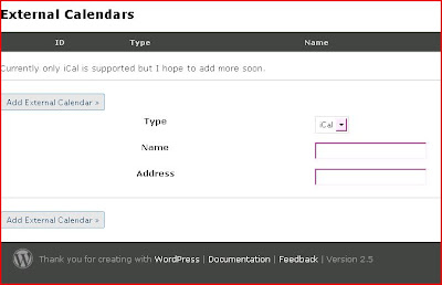
  • Below on the same page you given the option to add an event. The date once submitted will be displayed highlighted in red as a date on the calendar located on the main page. If the user is to scroll over the date with his/her cursor then in a popup bubble the discription of the event, the date it happens and the time it starts and ends can be viewed quickly.


  • Should it so be wished in the future the user can integrate a more sophisticated event calendar system, with support for iCal already and Google, Yahoo calendars to come.


  • This now shows the date as a red marked number on the calendar. Underneath that is a news message that can be set to make reminders, among other things of what's coming up.


  • This image show the cell of text that appears over the dates as users scroll over them. This bubble of text displays the details entered in on the calendar.

27.3.08

The Banner in Working


The above image is to remind you of what the original website used as it's header.


  • Starting off with just this image, more so just to have something in while I worked out how the image should sit within the page.


  • To round the website up together I decided to use a border to encase it. I took the first image and simply bordered it off. I feel having a website that is neatly displayed in the center of the screen and clearly marked usually makes for a warmer website.


  • To try and give the website some color I gave the banner one of the images used in the previous version of the website. While nice, the image was too large and garish underneath the badly colored and overly spacious corporate logo and tag line image.

26.3.08

First Attempt At Skinning

My First Skin


As a first attempt to get the style going where I thought it should I started by simply tweaking the colors and images of the original Kubrick without changes to the core structure of the CSS layout. This is mostly so that when the next major release of WordPress comes out, within a month or 2, I could easily migrate over without too much hassle. That, and when the new version of WordPress arrives I could also switch seamlessly into the new K2 release of Kubrick. http://getk2.com/about/


K2


This new and much more advanced version of the default theme engine I based my current designs on can process a much more in terms of script capability, much of which is built in. Improvements in K2:

  • User-friendly.
  • Admin-friendly.
  • 100% open source.
  • Semantic XHTML, CSS and JS structure.
  • Supports custom CSS files.
  • Smart layout adapts to needs.
  • Fully configureable from options page.
  • Upload and manage custom headers.
  • Sidebar Modules comes bundled (with special K2 modules) and support WordPress Widgets.
  • Live comment posting.
  • Livesearch.
  • Rolling Archives.
  • Dozens of plugins supported out-of-the-box.
Ok, so I probably won't ever need any of that? True, but it's always nice to have there in case!


Back to my skin...

I went with very similar colors as to the original theme to begin with. Choosing the lighter blues and keeping it fairly simple. Using no images at this point, but leaving enough space that I might be able to incorporate some.
While the fonts and layout wasn't how I'd have entirely liked it at this stage, I felt this would be how I'd like the end product to end up layout wise.

The banner however needing much improvement immediately!

19.3.08

Watergate Bay Beach Hut


Watergate Bay Beach Hut, doesn't exist. It's parent website does however, and it's not bad, it's just too much unnecessary Flash that puts me off it. The images used look fairly amateurish, but I can see the direction they were hoping to go in. It's just not a style that I think works for the website.

18.3.08

Venus Company


Venus Company, this is a actually quite a good website despite it's old fashioned layout and look. As was stated by the client also. The website offered as much information as you could need, it was laid out in such a way that made it easy enough to navigate, quite a lot of scrolling needed for certain pages though. Possibly more concise page content was needed.

The menu page that it provided was much better than the previous website I looked at. It looked much friendlier for a start, but again gave little feeling of the food without images with which to back it up.

Blue Bar

Blue Bar is a bar located in Porth Towen, a place I know. I have eaten and drank at this bar and the website compliments the feel of the bar well. I think this is quite a nice website and despite the client stating that she thought it looked somewhat messy I would have to disagree and say it's fairly clean and easily navigated.

I would have to say however that I don't think there's any need for a Flash banner at the top of the page, however this does add to it's modernistic appeal. I just don't feel it's desirable to have a Flash banner that has to pre-load on a website such as this.

The menu page has been nicely done, giving a good feel to the food using some nice images. Although I'd have to say while the potato wedges there are quite nice, they're also quite soggy and expensive for the amount you receive.

This website is again a good example of why decent images are required on a website such as this.

Wilf's Café


Wilf's Café, is as the client suggested; informative, but without any artistic merit. While I'm quite a fan of the very simple web page I must admit to this one lacking somewhat and creating no real appeal for the place.


However this website had obviously not been created to push the café to much via the internet, which is fine. Despite it not being overly pretty I don't think there's a whole lot wrong with this website other than the strange way in which the links have been set about the page.

17.3.08

Panoramic Photography + Viewers


Recently panoramic imagery has been something I've been looking into quite a lot. I find it very interesting to view the various images you can find on the web. Having been looking into it for quite some time I've found some very interesting 360* imagery and devices for viewing them. At the top of my list of impressive programs is the Microsoft HD Viewer. This highly advanced utility is for both the creation (stitching) or panoramic images or for the viewing of them. It's also for use more specifically with HD and gigapixel 360* images. The application can be ran and viewed as an ActiveX applet that installs into your browser.


The application can be used to fully zoom in on tiny aspects of a large HD/Gigapixel image that's been taking using fish eye 360* panoramic pictures such as this image above shows. Look how the image can be zoomed in from such great distances. Baring in mind this is not software that stitches various pictures taken already at different zoom levels but instead stitches in a series of VERY high detail panoramic images.

Other applications for this software is the CCTV version. The software can read live fish eye lens feeds and convert them into flat panoramic images. This allows a single static situated CCTV camera to capture a full 180 degrees of photage that can be viewed from a remote console.

A few other sites of interest are listed below, some really good panorama's on them:

Panoramas.dk
Bohonus Virtual Tour
Panoramic Stock


Ric Stultz


This is some wonderful artwork by American mixed media artist Ric Stultz. A lot of what Ric creates is of a very postcard, comic cell style but in such a manner that it takes on a much more extravagant poster art feel. This comes down I think in large to the use of paint splattering. Although the work displayed here could more than likely be entirely created using real world tools like the brush and pencil I expect there's a heavy use of digital manipulation amoungst it. I would be interested to know to what extent the computer has been used here to touch up, or perhaps even fully create.

Ric Stultz

HTM2PDF


This is a HTML to PDF converter tool that works from your browser. You can either paste in direct your HTML or give the website a URL to convert. From what I've seen and heard, this is a very powerful tool that works well. I'm sure there are others out there that are just as good but so far this is the only decent one I've found that doesn't require a fair amount of time for the PDF to be emailed to you. In fact this doesn't ask for your email address what so ever, which is nice as I for one hate giving me email out to anyone. Especially a service that probably doesn't really need it.

HTM2PDF

Most Used CSS Tricks


I stumbled across this page the other day. It's essentially a short list of very useful CSS tricks. Included in this list are things such as how to round off borders with and without the use of images. Also included are more basic tricks, such as creating more aesthetically pleasing lists and forms. This isn't a one stop CSS resource, but it is well worth a look. Most of what's on here can be simple spliced into your CSS to sand off a few of those rougher edges.

Most used CSS tricks

16.3.08

Faces In Places


Faces in things is a lovely blogspot blog that is no more than a collection of Flickr streams from various users that depicts simple faces caught on camera appearing in items and unexpected places.
This is well worth the quick flick through the pictures as they're not only great pictures in themselves, but they are also very humorous to look through.

Faces In Places

Little People


Not midgets, but little plastic models of people. This is an art project, or time filling interest, that is simply someone placing tiny plastic figurines in various locations and taking photographs of them. The figurines are situated in such a way that they look like they are doing such activities as to make them look almost as if they the correct size (in most pictures). On the whole though it's just quite a funny collection of photographs. It's just a nice idea that I think has been done well. Something quite nice to look at.

Little People

Door.swf


This is a straight loading animation made using Flash. It follows the story of a man trying to get through a door as he's presented with many obstacles he has to overcome. It's worth a look if your after something to watch for a couple of minutes.

door.swf

Porthminster Café

The second link I was sent by the client was that of Porthminster Café. This website is appawling. Websites like this shouldn't have Flash intros to them, and on top of that they shouldn't be this badly made, or for that matter link to the main page using popup windows that most browser's now block without question.

A splash page might have been OK, given that there is a 2 way split as to where you go once you arrive here, but to have an actual intro that literally takes a long time to slide some text across the screen is a little absurd.

The actual website, as can be seen in the first screenshot was very ugly and had been obviously badly designed from the ground up. The icons, buttons and color scheme were boring and sloppy.

They had menu's on the website that were simply large lists of unimaginatively laid out text. Not very inspiring when trying to entice someone to come and eat at your restaurant.

The website did however remind me how I need to be thinking about implementing some sort of method for locating the café. So far my favorite option is to link to the Google maps page that points to the café's location. This is easily created and serves it's purpose better than poor res images that don't really give enough detail.