14.12.06

Task 3 - Evaluation

I set out to make a web based slide presentation of a computer game of my choice, for all intensive purposes I think I've succeeded.
The site is to the point and contains the theme I had originally intended and set out to achieve.
The only downfall to the site is that I didn't get hold of better quality imagery, however this is mostly overlooked when the site is run in it's intended 800x600 resolution.
Although the website runs perfectly on a Windows based PC for some reason a mac has difficulty rendering some of the images used within. I'm not sure why this is but it's something I'd like to know how to overcome as most of my work is now based on macs.
It would have been nice if I could have included some streaming video into the presentation but as it is I couldn't work out how to get things to load properly and for that matter find video's that were of stream able size on the web.
It's unfortunate that the game I chose to promote hadn't released a proper web kit with their designers pack, the kit is very out of date and thus I could not show off the true graphic splendour of the game as I couldn't have it installed to screenshot for myself.
I would have also liked to give the site some more time dedicated to dynamic and animated content, this is something I'd be very interested to include in any future projects I undertake of this sort. A lot is lost in the presentation of the game as I could not get enough animation included.
The show was a success on the whole, there are definate points I would like to have remedied and the comments left by students in the class have given me a real insite into how the flash application could have been better put through it's paces.

Grotesk and Monstrous

A wonderfull website, it's clean, has beautifull sound and visuals. The site is immersive and concise. It's got wonderous illustrations and has had my attention and admiration throughout this and my previous course.
Most of my work stems down to just a couple of websites for inspiration, this is one of them!
All done in flash with some very nice steaming imagery.

Task 2 - Website

Follow this link to view my website.

Evaluation

The website works, it's concise and it's (in my opinion) well layed out. The major and really only regret is that I could not get 'just' the new content to load and have the banner and nav bars to stay constant. This is something I'd like to look into during a year 2 product. Investigating more advanced code languages and create a more dynamic website experience.
This website however is perfect and just what I needed it and intended it to be, bar one minor detail. There's a flash addition situated underneath the nav bar that does not load when on the web but seems to work fine when run from a local source. Odd, but to my best attempts unsolvable. However annoying it is the flash item under the nav bar was purely cosmetic and not that good anyway so no harm done.
The website contains everything it needed to contain and manages to maintain a constant style and is easy to navigate and use.
There is one element to the website that I feel set's it aside from others and that's the mixed up language/spelling used on the nav and title. I like people to view my work and find it not immeadiately accessable, I want them to spend just a moment think about what they're seeing. This is something I think playing with the text in this manner achieves well.
The project was for all intensive purposes a success and a style and basis I would like to work on in the futre.


Research

Angry Blue

This is a web design, illustrator and general new media artist that I adore. His primary role is to create band art, posters, CD covers and mechandise and has worked with some of the most widely famed bands there have ever been.
His art is somewhat odd, far from unique, but tends to hold well to his particular style. However, he's a good media designer to employ as he follows briefs set very rigorously. This can lead to some of his art being somewhat disapointing but at the same time admirable as he takes difficult tasks and succeeds to inject brilliant illustration and design.
His website is lovely, it's plain and simple to navigate and portrays all his hall mark designs. It's very well layed out and a perfect platform to advertise his skills as a media designer.


Task 3 - Progress


What I Need

The first thing to look for is to get the slides looking as if they've been themed as the real Dark Age of Camelot team would of themed it. This I think would be best explored via a webkit. Most games, and to my knowledge this one as well release webkit's. Packs containing graphics and various web materials for building fan website. This is a great way for the game to promote itself through methods that both cost nothing in money nor staff time.

Making the show:


  1. Take border graphics from the main DAoC website along with banner graphics from the webkit.

  2. Background applied, simply the glow background from one of the webkit graphics.

  3. Fade applied, when a screen is changed it will flick to black and then fade out to the new graphics being displayed.

  4. Added next button and next page.

  5. Added previous button

  6. Added initial slides

  7. Gave slides and transitions between pages a fade.

  8. Re-did the title bar

Final step included polish the edges with black strips and borders while at the same time adding the final slide which displays the creators tag.


Task 3 - Initial Work

Rationale

For my project I will be attempting to design an aspect of advertising for a computer game. I have chosen the game and the advertising will be a sort of web based slide show that tries to show off the aspects of the game that potential customers might be most interested to see.

In order to create this I will be asking people to fill out questionnaire's and investigating already practised forms of game advertising. I shall be asking primarily into what type of player I'm trying to reach and what sort of styles would be most fitting to reach this end.

The idea of this web slide show is to promote the game quickly, effectively and without forcing the user to trawl for detail himself. This is also a perfect platform for advertising very selectively. Leaving out information or spinning information that has driven old users away. The game I have chosen has many downfalls and is currently supporting it's slowly dwindling numbers on old faithful players with very few new comers. Any accounts made again are almost entirely made up from returning users. This shall play a major aspect in the advertisement, trying to persuade old users that the game is worth returning to.

In respect to the design of this presentation I will be using the already established theme of the game and be making it in flash to allow for the greatest use of visual styling and clean modern look the game needs so sorely.


Questionnaire

How old are you? Circle one

10 and under / over 10 – 15 / 15 – 19 / 20 – 29 / 30 and over


What gender are you? Circle one

Male / Female


What top 5 features do you look for in a massively online multiplayer role playing game? (MMORPG)


Do you prefer a game to be complex or simplistic? Circle one

Simple / Complex / Not bothered


Do you like your games to feature mature content. Gore and the like? Circle one

Yes / No / Not bothered


Do you look for good graphics in a game?

Yes / No / Not bothered


Do you look for a game that will run smoothly on your computer?

Yes / No / Not bothered


Is player versus player combat important in an MMORPG?

Yes / No / Not bothered


What is your favourite MMORPG?

.........................................


What my Questionnaire Returned


In my questionnaire I tried to determine what would be the best things to advertise and in what order they should be advertised on this web based feature's slide show.

The age rage is primarily from 15-19 on the questionnaire but on asking players within the game how old they were the reply was mostly between 20-30 with some exceptions leading to almost 50!

Features that the questionnaire determined as being the most sought after were a large player base most of all and a particular attention to the player versus player detail of the game. Both aspects are not unique when it comes to a massively multiplayer online role playing game such as this but in any cases are usually some of the most important aspects to focus on.

Another item raised by the questionnaire that bares particular importance to this game is the fact that advancement past the highest attained level should be important. This is very important especially to this game as it's going to be aiming a lot at returning old users. Advertising the advancement the game has made recently to show of what new points of interest the game has to offer and what the old users might not have tried yet.

As with most MMORPG's this game is one that updates it's content on a fairly regular basis with new expansions being released along side continually added features and fixes.

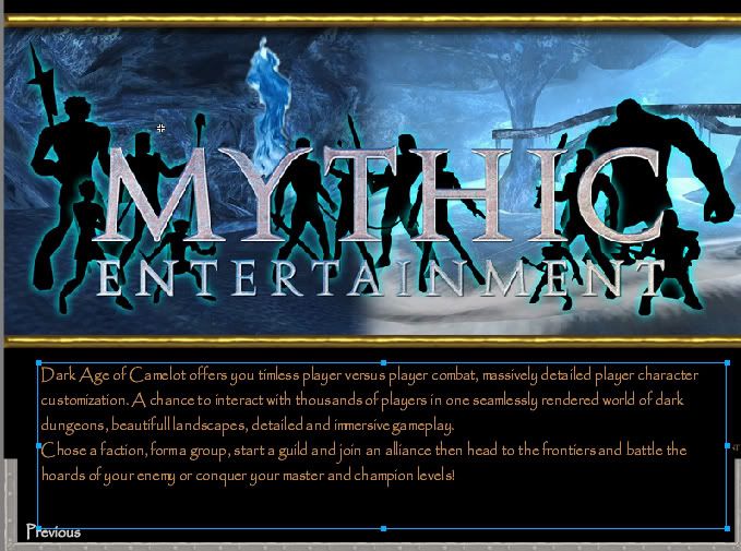
Players of Dark Age of Camelot are on the whole of the older age range and on the whole enjoy a game that is complex to play and tricky to master. This is something Dark Age of Camelot does offer. This game is not for someone who has a dislike for number crunching and tactics. However, this isn't something that most new users would be looking for in a game so this is something that I shall be practising selective advertising on. I will however mention in an under hand way that the game does feature many customizations that require some serious thinking. Hopefully in a fashion that most new users might overlook.

All the questionnaire's returned that users look for a game that runs smoothly on their computers, this is something Dark Age of Camelot does achieve and something I will be making a particular note of.

The greatest thing this game does feature is it's attention to the player versus player combat aspects. It's taken the idea of combating players to a previously unforeseen level, especially with new and recently released features.


The Games

The questionnaire returned 4 favourite games. Only three mostly due to the fact that the only people I had available to me to ask in person were people I have met before. The trend of games tends to circle close when it comes to acquaintances of mine.

The four games were:
Ultima Online

World of Warcraft

Jennifer Nation

Dark Age of Camelot


Ultima Online:

This game has been around since the dawn of time, it's one of the first of it's kind and boasts still some of the most immersive game play your likely to meet. Since the good old days Ultima Online has changed little and yet still maintains a good honest (and somewhat ageing) player base mostly consisting of over 30's.

The features it likes to press the most is it's age, this is something Dark Age can't rival but it is something it can say it has of it's own. Dark Age has been around a long time and has created some new unique concepts that other games are now trying to copy.

In particular to Ultima Online, and what in most cases keeps the players it has, is it's sense of community. The servers (or shards, as MMO's like them to be called) are quite small compared to modern standards and at the most will never have more than a few hundred players on at a time. Dark Age can support well in excess of a thousand players.


World of Warcraft

We've all heard of it and like it or not it is massively popular among most age groups. It's a trendy game that's loaded with features. However the thing that let's this game down is it's complete lack of depth. Once you've hit the top that's really where you stop and most players don't even reach that before they get bored of the linear and repetitive gaming.

Dark Age can't be rivalled on it's features beyond it's maximum level, in fact a lot of players even loath it but it is something that new players don't consider and old players would be interested in. Dark Age tries to cling onto the players it has by enforcing how much there is to do for players that think they've almost got it all covered.


Jennifer Nation

This sweet little game isn't really much to do on. It's a role playing web browser game that features no player avatar and instead is a micro management game based on moral dilemma's. I shan't be looking any closer at this.
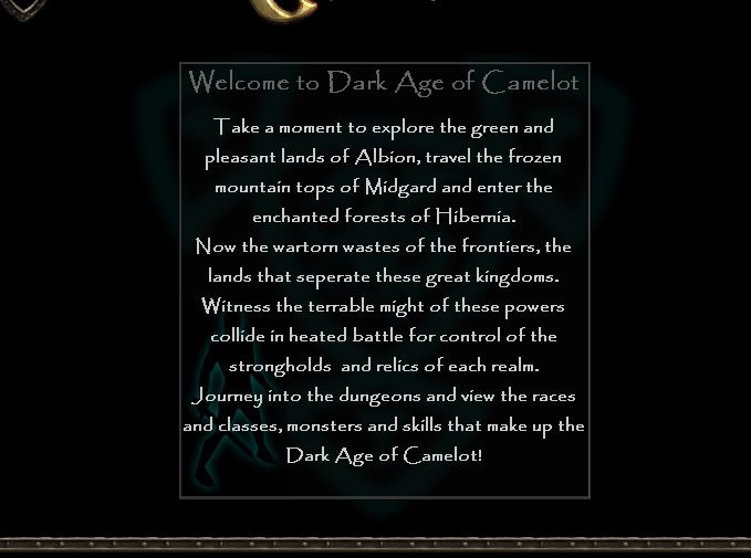

Dark Age of Camelot

I shall cover this in a different section.


What I Need to Include

Aspects:

Player versus player combat:

This featured highly on the questionnaire, more or less everyone requested it.


Customizations (Character development)

Player classes, character statistics and the sort of play styles available


Player presence (Character building)

In a massively multiplayer online game with many other players being an individual is hard and a game that promotes a large sense of unique presence is usually onto a winner. This was something that came up as being quite important in my questionnaire.


Quests

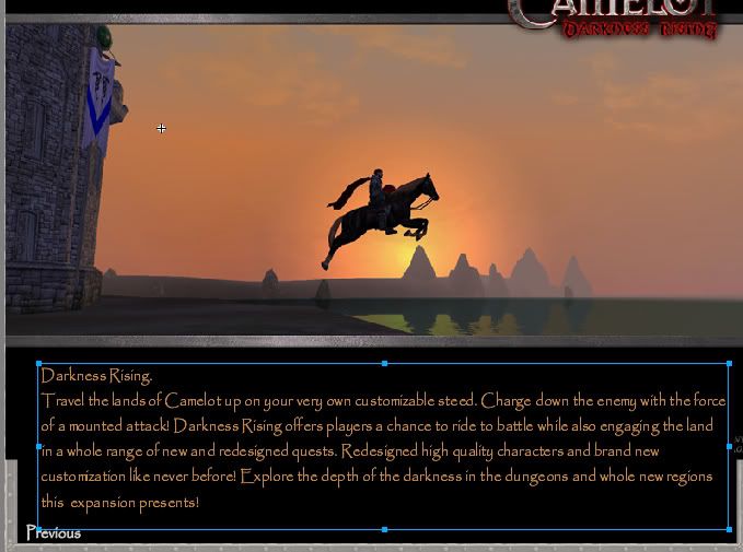
Questing is an integral part of role playing games, it's something they all have in common in whatever forms they take. DAoC is no exception with massive amounts being churned out and a recently released expansion dedicated to quests among other things.


Groups of players

The questionnaire showed that people are after a game that features the ability to 'group' with other players to participate in events. Dark Age has this down to a fine art with many grouping features. This is something I'm going to play on as an MMO is often very group orientated.


Graphics

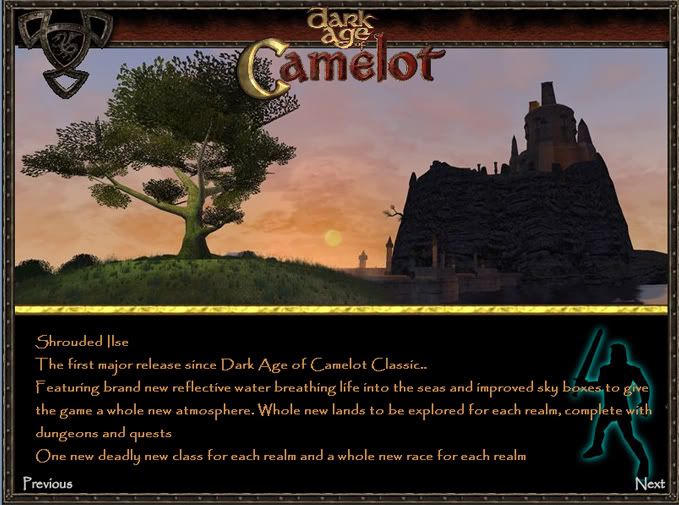
Dark Age is an old game and it's graphics were becoming outdated but it's managed to stay ahead of the competition in many ways by keeping itself updated with the recent remodelling of many in game elements. I think I'll have to have a slide dedicated to the graphics that it shows off best.


Size of the player base

MMO's are about the players, Dark Age although dwindling since it's prime day's has managed to boost per server player bases by merging servers and combing certain area's with other servers. A server in the US will never have any less than 300 online and will usually push at least 5 or 6 hundred. Populations often reach in excess of one thousand and can even get as high as two or three thousand at peaks.


Item craft system

One questionnaire mentioned they liked MMO's with an item craft system for players. This is something I'm fond of as well, it introduces dynamic economics and adds a whole new dimension to what's going on in the game. A game such as this orientates itself on the dynamism of the virtual world, this is a great way to invoke this emerged and dynamic feeling we crave.


Story

The defined game story is often unimportant or at least mostly ignored by players who prefer to focus more on the player orientated events and plots. However, a plot of at least some description is often required to give the game direction and let players know what's going on.


Online continuous play

A gaming world that doesn't sleep, it's something that all MMO's will boast and something that DAoC doesn't lack. Once your character logs off the game doesn't end, players continue the plot and events still take place even in your absence. This should be made well known in the slide.


7.12.06

My Images (right) analysed

Many of the influence's that govern my work comes from exploring random sites and anonymous artists that I have found over the years. I very rarely stick to one specific influence nor do I prefer to keep my work in any particular style. However, influences that definitely have governed my work have been the work of American new poster artists. In particular, Angry Blue. Primarily the artist who works mostly under the seudonym of "Angry Blue" creates band art, CD covers and advertisement in still print.
I like my work to come out as if somewhat disturbed. Human figures often are the centre of the attention but rarely look like a normal human being. When someone views my work I would like to think they remember it for it's mis-shapen forms and techniques that give the figures a pained look. When something doesn't look quite right, but not entirely wrong, people tend to pay attention more closely and in the end remember it for longer.

Binannary
This image was created from a photograph of my girlfriend that I traced over using 1's and 0's. Binary + Anna = Binannary... get it? Clever aren't I?
This image (best viewed on a mac, for some reason) was created with the intention that it be shown on a massive scale. The image would only form once the viewer moved back from the image. It's not a very original idea but it is one like I'd like to explore further. It's very based on the art movement "ASCII".

Tale
I love forcing two images together. This is something that most media designers experiment with at some point in their lives. In this case the image of a cat + a woman were the only two images I used. As for influences on this one, they really do just come from the experimentation and browsing of art related websites.

Lick
I wanted to use the image of a beautiful woman, in this case a stripper, and then alter her face to make her appear less beautiful but without altering the dynamics of her face. I.e. no mindless nudging and warping but instead to overlay images on top of her. This again has been created using just two images. That of the woman and that of a scar from a boys arm.

Bent Over
This was a doodle, I like experimenting with form, such as in most of my images again it's a person. I love to take a recognizable shape and transform this into a still recognizable but somewhat crippled form of what it 'should' be.

Scared of You
This is very much influenced by the American poster art that I spoke of previously. The idea was to create a scene that was not explained. We know there's two figures, they look humanoid, but we can't work out why they're in this huddled position or from where/or what time they represent.

Photo Essay (baby grow)


Surrealism

The movement arose shortly after the end of World War I in France. It was a reaction to Dadaism, which in turn was a reaction to “logic” that which Dadaists believed had caused the war. Whereas Dadaism sought to revolt against logic with near pure chaos Surrealism sought to rebel with more structured manipulation of reality. Surrealists preferred to use psychedelic studies into the sort of mind analysis Sigmund Freud would make. They would try to explain the human mind by forcing people to expand and confront its boundaries.

Although surrealism is most commonly associated with the visual art it extends to most forms of artistic expression. Alongside the artists were the poet’s in particular. Mostly the poet’s would write about love and nature. Although surrealism did exist in most other forms of art it was mostly a point for other related mini movements to spin of from it. Usually start in a definite sort of art type or the other. Sculpture, prose and the like.

Semiology

The study of signs and symbols; the implications, invoked sense's and how we relate to each in connection to one another, the final conclusion or even the implied conclusion in relation to every active signified or signifier.
Semiology is the study of how meaning is created, not what it is.
The problem with semiology is in the very definition of the word applying to every aspect of our lives. The word itself confuses its own conclusion in that it is subject to relativity, more or less its own study. Signs and symbols do not carry a solid universal meaning, this extends to all forms of such, even lettering.
Even though semiology is technically very difficult to define, it is this very confusion that makes it very hard to disprove an argument on its definition. My understanding of the word, based on the forms presented to me thus far is this.

Semiology is more than the study of signs. Semiology is the study of age, social class, fashion, quadrivium, the junctures of these and many other aspects. Semiology is how we perceive the world through a relative perspective and how more importantly we perceive other’s perceiving the world.

An example of a semiotic study:

A cigar; a sign of wealth, relaxation and an easy life. The proletariat might perceive this to be a sign of things out of their reach perhaps? The smugness of the bourgeoisie? Furthermore to this we must consider its placement, is this item found as an image or a physical prop? As an image we immediately try to find more its meaning than simply an item. Item’s (I feel) are considered more an immediate acceptance and thus less is thought of them whereas an image is to invoke feeling and an item is usually (in this case particularly) created for the usefulness to ourselves, not for others. Example:

A cigar is used by us to smoke,

A picture of a cigar is more commonly used to the designers end. Advert imagery etc.

Tracing semiology back it is most commonly associated with the Swiss linguist Ferdinand de Saussure and American philosopher Charles Sanders Peirce.

Semiolingo

Sign: The very basic unit of meaning. A sign is something that creates meaning. (Umberto Eco’s wrote: “a sign is anything that can be used to tell a lie”).

For every sign we have two major aspects:

Signifier: Any material thing that signifies, e.g. text, facial expression.

Signified: The concept the signifier refers to.

For instance the text “man” is the signifier. When we read this we think of a man, this is the signified.

Denotation: the relationship between signifier and signified. The literal meaning of a sign. The text “man” signified to us a male human.

Connotation: This is when a second signifier is introduced. For instance if we introduced the text “idiot”. The picture of the man is then not just a signified but becomes a signifier as well. The signified is the picture in your head. A stupid man maybe?

6.12.06

Leonardo da Vinci Exhibition

A couple of months ago I attended an exhibition of some of his work at the Henry Moore institute. More specifically this was directed at work rescued from some of his sketchbooks. It's quite an incredible thing to actually see work at two inches from your nose that has been drawn (as in some cases) in complete day dream ignorance by one of the worlds greatest thinkers and artists. Due to the age, paper and the condition in which they were kept the sketches had even picked up print from pages they were kept against, illuminated in the gallery with clever lighting you could see text and doodles layered on top of each other.
The gallery room used was small, the collection not huge either but the gratification from being able to get so close to the work was just fantastic. Leonardo has always been one of my favourite artists. Not for his oil work which receives greater attention but for his genius sketch work. There's something that conveys more an artists skill in sketch work than in all his most celebrated work combined. Something in the fluidity and the thinking I feel is lost when work is planned. I prefer a more instant transcribing process between brain, pen and paper. When viewing exhibition work that contains sketches you can feel so much closer to the artist and what he was thinking. The moods and the feelings he was experiencing at the time. Doodles are like snap shot views of the inside of a person.
I particularly appreciated in terms of the gallery how they planned the space in which the work was laid out. The room was mostly a dull matt white and the work contained within glass casing's which were in most cases illuminated from behind as well as general area lighting. Some of the work was suspended in the air via metallic woven cords and double backed glass frames. The effect was quite clinical and modern which was a really nice touch to an exhibition of what is commonly associated as rather ancient art (although as time goes, not really that ancient).
The artwork itself was a collection of sketches and scribbled writing (although by any modern day standards intricate and fluid). They were plans for work, idea's for future projects and general visual thinking. It was a little like a mind map but without the bubbles and lines we associate more commonly with planning. They even had an initial sketch of Leonardo's most famous work Vitruvian Man, which by most accounts is a sketch itself.


Along with the Leonardo exhibition there was a modern minimalist exhibition in the same building. This is a good contrast to the genius of Leonardo. I do not like 'minimalist' work on the whole. There's nothing wrong in my view with an image or sculpture that makes use of minimalist techniques. Clean and simplistic, layout and colour choices at the optimal point of the design but in most cases I feel it's just a plain bore, this was no exception. The work was made up of large white coloured boxes differentiable from large plainly coloured crates and boxes so far as that a large crate or box actually has a real use. This offered no practical or artistic use, it was not pleasant to look at nor was it well thought out in any obvious manner.

The room was badly designed, a dull room that was no different from any other, it was filled with (in the centre) a collection of boxes of varying size. They weren't very well painted, the plainness of minimalism seemed lost in this as the room's lighting and layout offered no aesthetic pleasure. Maybe the artist/designer was trying to tell me something? I couldn't see any reasoning behind it. Maybe there was a hidden message I was not getting, but what's the point in messages if their hidden and there's no real incentive to search an answer out?


All in all the other items on display were interesting to view, some great sculpture at the entrance using optic fibres and LED's. Some very interesting photographic works and even a large collection of famous sculpture prototypes on display. A good trip, just a disappointing display from the minimalist front.

Digital Art

Christiane Paul - Digital Art

Exploring the section "Internet and Nomadic Networks"

The book is dedicated to various emerged and emerging art types related and originating to the digital world. This particular section focuses on the World Wide Web and how art orientating around it, has developed into a new movement. It explores how, for the first time, art has become a dynamic multi user experience, the WWW as a platform for users of varying experience in the field to collaborate together and create art.
The web has been around a long time, it's concept since the later years of World War 2, but not until the early 60's did it start to emerge as a new and accepted form of communication. It was not until the mid 90's however that the internet has been made more widely available to a general audience.
Art on the web with commercial backing has been around since 1984 when the National Science Foundation involved itself with ARPANET, an artist network. Possibly the first of it's kind. Pioneering the arts organizations however was New York based "The Thing". A simple bulletin board system for contemporary and cultural theory. In the 1990's the advent of HTML was conceptualized and made to be a collaborative multimedia information system. As HTML came to the fore front of web design so did the .com domain craze. This was really the spark that started the flash fire of commercial web enterprises.
Many new art related groups emerged during the late 90s. Of particular importance the NET.ART movement dedicated to net art (oddly enough). This is a good example of how art groups started to perceive how web art should be approached as this NET.ART movement was criticized when a conference of it's members was organized. The meeting was very exclusive and in an art movement that orientates around a global network this was thought of as a double standard. More open and incorporative communities were created as a result of this.
As web art took off, a more community based experience, the platform for users to interact became an issue itself and art started to approach the very foundations of the communities. Multimedia sharing became as much an experimental and involved experience as the work that was exhibited.
The most important and interesting point this section of the book brings to light is how the cyber is finally in decline from a digital experience back into a physical one. We are now experimenting with new forms of artificial intelligence which, although still basic, are actually not formulated on how much further we can take communication in terms of innovation but how we can revert our current innovations back to ancient communication forms. A good example of this is "Text to Speech". We want to prove to ourselves that our technology can be used to improve upon some of our most primitive information delivery techniques. This is a point that really comes accross while reading the section, and for that matter most of the book.

Image Analysis (essay and answer sheet)

This image is found centre top of a web page. This is not a well known image, nor an image that anyone has studied before bar those looking perhaps for a simple example of commercial image design. It is merely an animated image aimed at drawing the attention of the reader to the aspects the website beyond it promotes.

This image is not an entirely unique image as far as what it's trying to promote and as far as what it is aims to achieve, but the image is not an exact replica of any other that I have seen. The style's used and the context they are used in have been used many times before. This image (with small animation aspects) was produced in the Summer of 2006. The historical aspects include it's use of the new media. The animation and indeed it's location (the web) are very modern mediums. The design is obviously aimed at new consumers with flashy and clean graphics. The main focus of this design is the simple shopper figure image at it's centre. The content contains firstly, a new media type, associating itself with the modern. The person in the picture is female and thus we can assume a feminine orientation within the site.

The media is digital stills imagery and flash animation. Both very modern media's. They have been selected as they are easily and cheaply created and are also easily implemented into a web based environment. The medium's imply that the website is current and fashionable. As far as I can tell this image has been purpose made for this exact use and is in an unaltered state.

There is only one person in this image, a young female holding shopping. The girl is fictional and represents a shopping of the facility that the website promotes.

The girl is wearing clothing that looks fashionable, she is also wearing a reasonably short skirt and has long hair (if not a little scarce) that moves as if being blown by the breeze. In addition she also holds a shopping bag in each hand.

The girl is standing in a very stereotypically feminine pose. Relaxed and with arms low, outwards and bent slightly at the elbows (as if to imply she's lifting something of mild weight, the shopping). One foot is somewhat out turned and forward from the other. The facial expression is in my opinion poor choice. The girl looks a little sad and the slow waving hair adds to this. The gaze is sombre and the eye's look down turned.

Judging by the clothes she is in the middle to upper class and looks like she might have some money, she is white and reasonably young in appearance.

The image was produced to catch the website users eye and thus promote the shopping facility. I know this because every aspect of every commercial website is designed with one key aim, to promote and boost company sales and reputation.

The image is location upper centre of the page, it's situated here because it will be the first thing the user will look at when loading the page. The image captures the users gaze.

The 2 shopping bags are the most telling prop used in this website. Immediately any viewer can tell they will be dealing with a retail website. The other images used around the girl are clean and “fun” shapes that promote the joy that visiting this facility with incur. The shapes are also in the form of flowers, perhaps to promote the freshness of the website?

Situated either side of the girl (on the shopping bags) there is 2 groups of text. The first text (located on the girls right side) tells us that on this website we can find out “What's On” and on the other side of the girl “The Shops” shows us we can browse through the various retailers within the facility.

The image has been produced for this retail group to promote and to boost company productivity, the image as best I can tell is not political but does serve to guide the user about what they find within. What sort of website this is and what sort of function it plays. The image tries to be as aesthetically pleasing as it can be to try and grab the attention of the user.

The more convert operations of this image try to portray the website as a very feminine affair and that it holds a classier sort of deal. The girl is as I have said I think in the middle to upper class range of citizen.


---------------------------------------

Questions and Answer Sheet (without the questions)

1. Yes
2. Contained within a website. Center page.
3. The image has not been written about. It is merely a animated image to draw attention to text.
4. This image is unique but not original. Many others have used this style and in this context.
5. This image (animation) was produced in Summer 2006. The historical aspects include it's use of new media. The animation and indeed it's location (the web) are very modern aspects of design. The design is obviously aimed at new consumers with flashy and clean graphics.
6. The image portrays that of a shopper. The content contains firstly a new media type, associating itself with the modern. The person in the picture is female and thus we can assume a feminine orientation within the site.
7. The media is digital stills imagery and flash animation. Both very modern media's. They have been selected as they are easily and cheaply created and they are easily implemented into a web based context. The medium's imply that the website is current and fashionable.
8. As far as I can tell the images are as they were originally intended.
9. There is one person in this image.
a) She is young, female and is holding shopping.
b) The girl is fictional and represents a shopper of the facility that the website promotes.
c) The girl is wearing clothing that looks fashionable. She is also wearing a reasonably short skirt and has long hair that moves as if being blown by the breeze. In addition she also holds a shopping bag in each hand.
d) The girl is standing in a very stereotypically feminine pose. Relaxed and with arms low, outwards and bent slightly at the elbows. One foot is somewhat out turned and forward from the other. The facial expression is in my opinion a poor choice. The girl looks a little sad and the slowly waving hair adds to this. The gaze is sombre and the eyes looked down turned.
e) She is a female. Judging by clothes she is in the middle to upper class and looks like she might have some money, She is white and reasonably young in appearance.
10. The image was produced to catch the website users eye and thus promote the shopping facility. I know this because every aspect of every commercial website is designed with one key aim, to promote and boost company sales and reputation.
11. The image is located upper center of the page. It is situation here because it will be the first thing the user will look at when loading this page. The image captures the users gaze.
12. The 2 shopping bags are the most telling prop used in this website. Immediately any viewer can tell they will be dealing with a retail website. The other images used around the girl are clean and "fun" shapes that promote the joy that visiting this facility will incur. The shapes are also in the form of flowers, perhaps to promote the freshness of the website?
13. Situated either side of the girl (on the shopping bags) there is 2 groups of text. The first text (located on the girls right side) tells us that on this website we can find out "What's On" and on the other side of the girl "The Shops" shows us we can brows through the various retailers within the facility.
14. The image has been produced for this retail group to promote and to boost company productivity.
15. The image as best I can tell is not political but it does serve to guide the user about what they may find within. What sort of website this is and what sort of function it plays. The image tries to be as aesthetically pleasing as it can be to try and grab the attention of the user.
16. The more covert operations of this image try to portray the website as a very feminine affair and that it holds a classier sort of deal. The girl is as I have said I think in the middle to upper class range of person.

27.11.06

Rationale

For my project I will be attempting to design and make a live website that promotes my media design skills. I feel this project would best serve me as web design is something I would like to become proficient in and a website promoting myself is something I could put to long term use (if it's any good).
I have both the web space and domain name with which to use for my project and would like by the end of it to be able to actually generate some user interest in it. This might mean promoting it with interactive media such as games and user submitted work.
Because the website will no doubt be the largest promotional aspect of a new media designers portfolio I am going to have to create a website that not only works flawlessly but also looks clever and well designed all round.
Because there is no end of web design and media design web site's out there I will need to devise some gimmick's that set myself aside from all others. This may well take the form of a more genre or scene based website. Possibly something that caters more towards a certain sort of person, whether that be by their taste in music or age.
Because my code skills are far from good I will have to spend more time focusing on the visual aspect of the website.
This project also allows me to display work created at college while at the same time continuing my work on a website created from a previous module.

19.10.06

Final montage

Before I start detailing my final montage I'll just mention quickly a little on my style of working. I can plan all I want, images, text's and research of all kinds, my final product very rarely resembles anything in the prior work. It would seem this habit has extended to my final image in this project.

My initial sketches depict a rather busy scene, I intended to fit much into this montage of mine. In my final image I came to realise that space was somewhat harder to manage than I had first thought and found myself craving the open space and the bolder statement the images I did include made upon the canvas.

However some of my planning has not gone to waste, I planned (as I do in much of my work) to use a maximum of 2 or 3 hues. As I mentioned, this is the case in much of my work so it was no wonder I decided upon this choice again. As a result the montage is almost entirely black and brown. With some hinting of other colour within.


I am a great admirer of stencil art. I love the black silhouetting and the way images aren't quite there in full. I tried to capture this same effect with my montage. The images have been cleaned up and then had the “stamp” filter applied over the top to give them that duo tonal stencil print quality.

I chose the corrugated card background because I wanted the art to look as though it was printed on an uneven surface. Such as stencil graffiti is often found on brick walls.

One of my aims was to get everything in the image connected via swirls and lines, when I came to adding this element in I found the image became to crowded and lost some of it's impact. Thus I decided the images were better laid out with plenty of spacing between. However, because this had the effect of making the entire image seem a little too empty I added in the staining to the background. The splodges and the very faint lines. This draws all the images together without making the entire montage seem to complicated to look at.

When planning my montage I did a mind map of interests that I could include in my project. A lot of different things came up, originally intending to use as many as I could. Because in this final version i decided to go with fewer images I had difficulty choosing which ones in particular that I wanted to use. I decided to list a few things that I showed interest in within an hour or so. As a result I included:

Clouds, I've always had a fascination for the sky.
Anna, the reason I am where I am today.
Music, hence the phono speaker emerging from the clouds.
A silhouette of my head.
Wine, beer and cigarettes.

The image has been entirely made using Photoshop and images taken from my personal image stock and that of Google images. Image quality wasn't such an issue with the montage as everything had the stamp filter over the top which resulted in any pixelation being smoothed out anyway. The only image I would have liked to get in high resolution would be the background. This image is the only one without a filter over the top.

I am not much pleased with this image. I find the whole thing somewhat empty to look at despite my decisions to reduce the number of images within. On top of that I would have preferred

to remove the white colour from within the stencil images, this isn't something you'd see in real stencils. You'd just have empty space in those areas. However, after removing the white to check what the result would be I found the image to dark and decided to keep it in.

As a summarized conclusion; a reasonable image in need of a few minor tweaks. A good basis from which other more thought out work might spring.

.

15.10.06

A Brief Look at Japanese Art and Manga Origins

When we consider Japanese art the most thought of example would be Manga (漫 画). Manga is a Japanese word that accounts for comics and print cartoons. The rest of the world think of Manga more connected with a particular style of racy and anglular drawings. Japanese Manga and Anime now commands a $5 billion global market.
The art style has been developed from a number of different influences, both Japanese and foriegn. The word manga in literal translation means "random pictures". The word was first used in the late 18th century along with publication of works by a number of artists and including:
Suzuki Kankei's "Mankaku zuihitsu" (1771)
Santo Kyoden's "Shiji no yukikai" (1798)
Another wave of works arrived in the early 19th century such as Aikawa Minwa's "Manga hyakujo" (1884) and more importantly "Hokusai manga". Hokusai was a famous "ukiyo-e" artist.
Ukiyo-e translates as "floating world" (more commonly translated into "pictures of the floating world") and is a genre of Japanese woodblock prints and paintings produced between the 17th and 20th century. They mostly feature lanscapes, theatre and sex. The art movement rose up amoung the urban centers of Edo (Tokyo), Osaka and Kyoto. Early ukiyo-e originated in popularity from the single color works of Hishikawa Moronobu in the 1670's but the style of ukiyo-e did NOT originate with him. Hishikawa was the son of a well respected dyer and silver/gold thread embroider. He studied in both the Tosa and Kano schools of art, both highly repsected institutions. You can see some of the teachings of Kano and Tosa in the works he produces. The bold outlines of Kano can be spotted in his landscape work and his Tosa background emerges through his human subject orientated work, which about a quatre of was erotic art (also called "Shunga").<br>Ukiyo-e art at first was made using India inks and then shortly after some prints were manually coloured with a brush. In the 18th century Suzuki Harunobu developed techniques for polychromal painting.
He used this technique to produce "nishiki-e", which refers to Japanese multi-coloured woodblock printing. Nishiki-e is made by carving seperate woodblocks for each and every colour and using them in a stepwise fashion. Although Suzuki was credit with the development of the technique used, it was an engraver by the name of Kinroku who created the technical innocations that allowed so many blocks of seperate colours to fit perfectly onto the page where they ought to in order to create single complete images.
Ukiyo-e was very popular partly due to how affordable they were. This was down to the fact they could be mass-produced. Men who were not wealthy enough to afford original paintings would oftens buy these works instead.
Originally Ukiyo-e art was orientated around city life. Featureing mostly courtesans, sumo wrestlers and other popular activities. later on landscapes became also very popular. The art created very rarely featured politics or people of stature above the lowest levels of society. Although officially sex was not a respected subject it continually emerged in ukiyo-e prints, it would even occsionally incure the wrath of the law on the publisher and artists who produced it.
The manga that we now enjoy really only emerged in the 20th and 21th centuries after "Dr. Osamu Tezuka" (1928 - 1989). He is generally regarded as the fore-father of Japanese Manga and Anime. His most famous creations were "Astro Boy" and "Kimba the White Lion". Osamu developed a lot of the modern techniques and styles used in Manga. Interestingly the large eyes that Manga is so commonly connected with originated from Osamu, more interestingly he developed the idea and style from that of the western cartoon "Betty Boop". In fact Osamu was a massive fan of the Disney animations and all his work has been in some form or another been inspired by Walt Disney. It was also with Osamu that much of the graphic violence of modern Manga has originated. Although by far not all his works were violent, as with Astro Boy, much of his work featured gritty story lines and a lot of mature content.

This is a brief write up of the first part of some notes taken within a lecture on Japanese. I mostly gained my insight into the art through wikipedia.org

12.10.06

Blue Screen and 3 Point Lighting

Sketch taken of the 3 point lighting and blue screen filming tutorial.

Apparatus used:
4 x Red head lamps (clear gel)
soft lamp
back lamp (high)
back lamp (low)
fore lamp
1 x Blue screen
1 x OHP screen used as soft light bounce board (preferably use "soft box")
1 x Subject
1 x Camera (we used an XL1)
1 x Laptop for real time preview


Initial Montage Ideas


The hardest design point in this task is the choosing of images to portray aspects of my life and my interests.
My initial idea is to have seemingly un-related images collected together with a single photographic image, such as a hand holding photographs.
I intend to have a photograph of my hand holding slips of paper between my fingers (more than likely using both hands). I will then super impose onto the paper the images I wish to use. I will then make the images and the paper combine to form what looks like old photographs. This design should get a nice minimalist style but at the same time allow me to cram as much imagery in as I should need. The images should be busy and full where-as the hands holding the images should be still and quiet, possibly on a calm, plane, white background.
Another route to take would be to instead of photographing my hands but to draw them holding paper. This would add (but may not look quite so good) a more personal touch to the work. If I drew my hands then I think I may have to draw over the images I’m using within the work in order to get things looking better connected.

Other ideas (as shown in image) have been that of a tree with images for leafs or just a scattering of what looks like old polaroid photographs.

11.10.06

500 Words


Savile Lumley

This was a poster run throughout 1914 and 1915 (the first 2 years of British involvement in World War 1) as part of a recruitment push to fill the 300 thousand new recruits that the government requested. As a result of such public pressure from adverts like this and many others in 2 years a million new recruits had signed up. The following year to that, conscription was introduced.
This particular poster tried to guilt trip young Briton's into joining the force by effectively taking a snap shot of what life would be like in post war. It attempts to depict your average conservative father in a comfy domestic roll being turned upside down by the guilt of not partaking in the bloodshed of 1914.
The pattern in this image is particularly clever I feel as the feint embroidery on the lounge chair and curtains contains what we commonly associate with very imperial coloring and shape. On the fathers lap sits the pretty bow tied haired daughter who has glanced up from her novel to ask her daddy... "Daddy, what did YOU do in the Great War?” His son sits by his side playing with his toy soldiers. The father stares at the viewer in guilt.
The greatest asset of this poster is the father’s head. It is as if the head has actually been cut out from the rest of the poster and inserted back in. The effect is that the head almost seems to stick out in a 3d fashion. This is the foremost thing that lodges in my brain when looking at this image. The somewhat displaced head is unnatural and thus our brain has to work harder on deciphering it.


The Uncle Sam Range

"Uncle Sam's Little Dinner Party...1876." A patriotic appeal to sell stoves. The whole world attends Uncle Sam's dinner party.
Here we see a dinner party run by a stove company that contains all the various stereotypes of that era. We have the upper class white being served by a black servant. Uncle Sam sits talking to “The World” with an eagle perched on his shoulder. All the colours used and indeed the pattern is entirely American. Red stars on a blue background, or of course red and white stripes.
I think it’s interesting despite the obvious anti black feelings at the time that they chose in this picture to depicts the world with a rather round African face.
The stove of course is the focus of this image, the sole supplier of this historic dinner party. It displays plenty of pots and kettles boiling on top, with even a roast chicken being produced from within. A testament to the versatility of this rather splendid luxury item.
My favourite aspect of this poster is Uncle Sam sitting at the table and appearing to offer the world food from his stove.
This is one of the ultimate pieces of commercial advertising and political propaganda combined I think we have ever had.

21.9.06

Welcome.

My blog, isn't it pretty?