19.10.06

Final montage

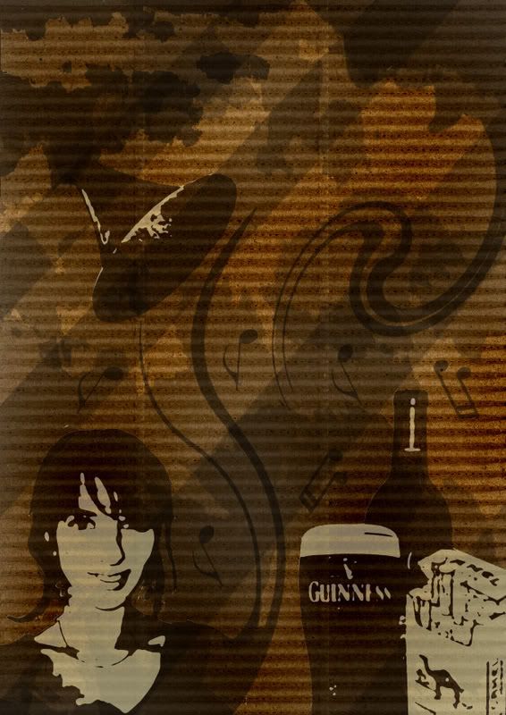
Before I start detailing my final montage I'll just mention quickly a little on my style of working. I can plan all I want, images, text's and research of all kinds, my final product very rarely resembles anything in the prior work. It would seem this habit has extended to my final image in this project.

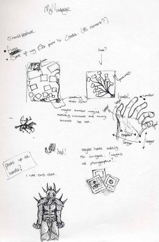
My initial sketches depict a rather busy scene, I intended to fit much into this montage of mine. In my final image I came to realise that space was somewhat harder to manage than I had first thought and found myself craving the open space and the bolder statement the images I did include made upon the canvas.

However some of my planning has not gone to waste, I planned (as I do in much of my work) to use a maximum of 2 or 3 hues. As I mentioned, this is the case in much of my work so it was no wonder I decided upon this choice again. As a result the montage is almost entirely black and brown. With some hinting of other colour within.


I am a great admirer of stencil art. I love the black silhouetting and the way images aren't quite there in full. I tried to capture this same effect with my montage. The images have been cleaned up and then had the “stamp” filter applied over the top to give them that duo tonal stencil print quality.

I chose the corrugated card background because I wanted the art to look as though it was printed on an uneven surface. Such as stencil graffiti is often found on brick walls.

One of my aims was to get everything in the image connected via swirls and lines, when I came to adding this element in I found the image became to crowded and lost some of it's impact. Thus I decided the images were better laid out with plenty of spacing between. However, because this had the effect of making the entire image seem a little too empty I added in the staining to the background. The splodges and the very faint lines. This draws all the images together without making the entire montage seem to complicated to look at.

When planning my montage I did a mind map of interests that I could include in my project. A lot of different things came up, originally intending to use as many as I could. Because in this final version i decided to go with fewer images I had difficulty choosing which ones in particular that I wanted to use. I decided to list a few things that I showed interest in within an hour or so. As a result I included:

Clouds, I've always had a fascination for the sky.
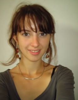
Anna, the reason I am where I am today.
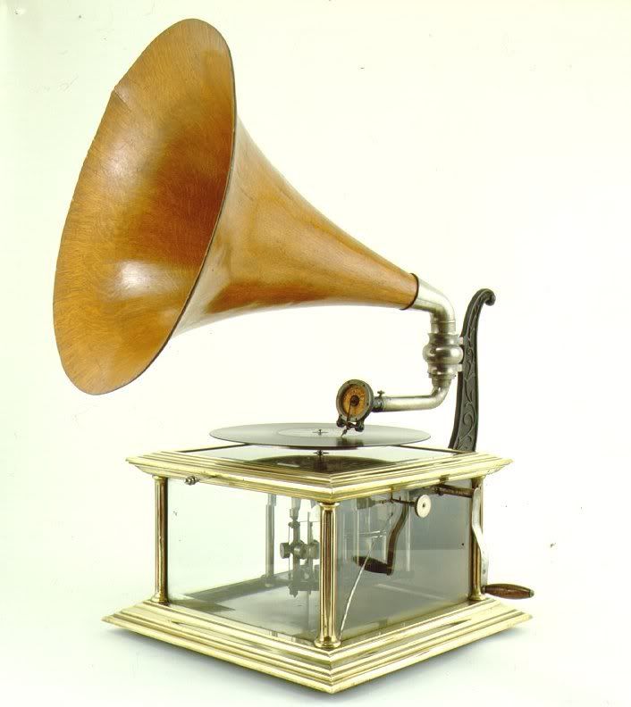
Music, hence the phono speaker emerging from the clouds.
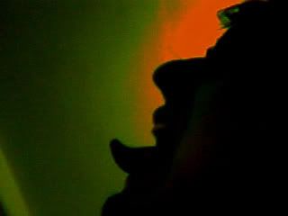
A silhouette of my head.
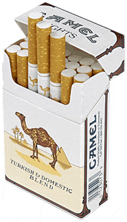
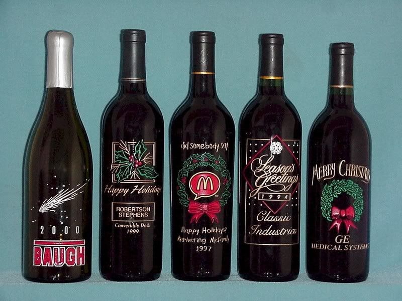
Wine, beer and cigarettes.

The image has been entirely made using Photoshop and images taken from my personal image stock and that of Google images. Image quality wasn't such an issue with the montage as everything had the stamp filter over the top which resulted in any pixelation being smoothed out anyway. The only image I would have liked to get in high resolution would be the background. This image is the only one without a filter over the top.

I am not much pleased with this image. I find the whole thing somewhat empty to look at despite my decisions to reduce the number of images within. On top of that I would have preferred

to remove the white colour from within the stencil images, this isn't something you'd see in real stencils. You'd just have empty space in those areas. However, after removing the white to check what the result would be I found the image to dark and decided to keep it in.

As a summarized conclusion; a reasonable image in need of a few minor tweaks. A good basis from which other more thought out work might spring.

.

15.10.06

A Brief Look at Japanese Art and Manga Origins

When we consider Japanese art the most thought of example would be Manga (漫 画). Manga is a Japanese word that accounts for comics and print cartoons. The rest of the world think of Manga more connected with a particular style of racy and anglular drawings. Japanese Manga and Anime now commands a $5 billion global market.
The art style has been developed from a number of different influences, both Japanese and foriegn. The word manga in literal translation means "random pictures". The word was first used in the late 18th century along with publication of works by a number of artists and including:
Suzuki Kankei's "Mankaku zuihitsu" (1771)
Santo Kyoden's "Shiji no yukikai" (1798)
Another wave of works arrived in the early 19th century such as Aikawa Minwa's "Manga hyakujo" (1884) and more importantly "Hokusai manga". Hokusai was a famous "ukiyo-e" artist.
Ukiyo-e translates as "floating world" (more commonly translated into "pictures of the floating world") and is a genre of Japanese woodblock prints and paintings produced between the 17th and 20th century. They mostly feature lanscapes, theatre and sex. The art movement rose up amoung the urban centers of Edo (Tokyo), Osaka and Kyoto. Early ukiyo-e originated in popularity from the single color works of Hishikawa Moronobu in the 1670's but the style of ukiyo-e did NOT originate with him. Hishikawa was the son of a well respected dyer and silver/gold thread embroider. He studied in both the Tosa and Kano schools of art, both highly repsected institutions. You can see some of the teachings of Kano and Tosa in the works he produces. The bold outlines of Kano can be spotted in his landscape work and his Tosa background emerges through his human subject orientated work, which about a quatre of was erotic art (also called "Shunga").<br>Ukiyo-e art at first was made using India inks and then shortly after some prints were manually coloured with a brush. In the 18th century Suzuki Harunobu developed techniques for polychromal painting.
He used this technique to produce "nishiki-e", which refers to Japanese multi-coloured woodblock printing. Nishiki-e is made by carving seperate woodblocks for each and every colour and using them in a stepwise fashion. Although Suzuki was credit with the development of the technique used, it was an engraver by the name of Kinroku who created the technical innocations that allowed so many blocks of seperate colours to fit perfectly onto the page where they ought to in order to create single complete images.
Ukiyo-e was very popular partly due to how affordable they were. This was down to the fact they could be mass-produced. Men who were not wealthy enough to afford original paintings would oftens buy these works instead.
Originally Ukiyo-e art was orientated around city life. Featureing mostly courtesans, sumo wrestlers and other popular activities. later on landscapes became also very popular. The art created very rarely featured politics or people of stature above the lowest levels of society. Although officially sex was not a respected subject it continually emerged in ukiyo-e prints, it would even occsionally incure the wrath of the law on the publisher and artists who produced it.
The manga that we now enjoy really only emerged in the 20th and 21th centuries after "Dr. Osamu Tezuka" (1928 - 1989). He is generally regarded as the fore-father of Japanese Manga and Anime. His most famous creations were "Astro Boy" and "Kimba the White Lion". Osamu developed a lot of the modern techniques and styles used in Manga. Interestingly the large eyes that Manga is so commonly connected with originated from Osamu, more interestingly he developed the idea and style from that of the western cartoon "Betty Boop". In fact Osamu was a massive fan of the Disney animations and all his work has been in some form or another been inspired by Walt Disney. It was also with Osamu that much of the graphic violence of modern Manga has originated. Although by far not all his works were violent, as with Astro Boy, much of his work featured gritty story lines and a lot of mature content.

This is a brief write up of the first part of some notes taken within a lecture on Japanese. I mostly gained my insight into the art through wikipedia.org

12.10.06

Blue Screen and 3 Point Lighting

Sketch taken of the 3 point lighting and blue screen filming tutorial.

Apparatus used:
4 x Red head lamps (clear gel)
soft lamp
back lamp (high)
back lamp (low)
fore lamp
1 x Blue screen
1 x OHP screen used as soft light bounce board (preferably use "soft box")
1 x Subject
1 x Camera (we used an XL1)
1 x Laptop for real time preview


Initial Montage Ideas


The hardest design point in this task is the choosing of images to portray aspects of my life and my interests.
My initial idea is to have seemingly un-related images collected together with a single photographic image, such as a hand holding photographs.
I intend to have a photograph of my hand holding slips of paper between my fingers (more than likely using both hands). I will then super impose onto the paper the images I wish to use. I will then make the images and the paper combine to form what looks like old photographs. This design should get a nice minimalist style but at the same time allow me to cram as much imagery in as I should need. The images should be busy and full where-as the hands holding the images should be still and quiet, possibly on a calm, plane, white background.
Another route to take would be to instead of photographing my hands but to draw them holding paper. This would add (but may not look quite so good) a more personal touch to the work. If I drew my hands then I think I may have to draw over the images I’m using within the work in order to get things looking better connected.

Other ideas (as shown in image) have been that of a tree with images for leafs or just a scattering of what looks like old polaroid photographs.

11.10.06

500 Words


Savile Lumley

This was a poster run throughout 1914 and 1915 (the first 2 years of British involvement in World War 1) as part of a recruitment push to fill the 300 thousand new recruits that the government requested. As a result of such public pressure from adverts like this and many others in 2 years a million new recruits had signed up. The following year to that, conscription was introduced.
This particular poster tried to guilt trip young Briton's into joining the force by effectively taking a snap shot of what life would be like in post war. It attempts to depict your average conservative father in a comfy domestic roll being turned upside down by the guilt of not partaking in the bloodshed of 1914.
The pattern in this image is particularly clever I feel as the feint embroidery on the lounge chair and curtains contains what we commonly associate with very imperial coloring and shape. On the fathers lap sits the pretty bow tied haired daughter who has glanced up from her novel to ask her daddy... "Daddy, what did YOU do in the Great War?” His son sits by his side playing with his toy soldiers. The father stares at the viewer in guilt.
The greatest asset of this poster is the father’s head. It is as if the head has actually been cut out from the rest of the poster and inserted back in. The effect is that the head almost seems to stick out in a 3d fashion. This is the foremost thing that lodges in my brain when looking at this image. The somewhat displaced head is unnatural and thus our brain has to work harder on deciphering it.


The Uncle Sam Range

"Uncle Sam's Little Dinner Party...1876." A patriotic appeal to sell stoves. The whole world attends Uncle Sam's dinner party.
Here we see a dinner party run by a stove company that contains all the various stereotypes of that era. We have the upper class white being served by a black servant. Uncle Sam sits talking to “The World” with an eagle perched on his shoulder. All the colours used and indeed the pattern is entirely American. Red stars on a blue background, or of course red and white stripes.
I think it’s interesting despite the obvious anti black feelings at the time that they chose in this picture to depicts the world with a rather round African face.
The stove of course is the focus of this image, the sole supplier of this historic dinner party. It displays plenty of pots and kettles boiling on top, with even a roast chicken being produced from within. A testament to the versatility of this rather splendid luxury item.
My favourite aspect of this poster is Uncle Sam sitting at the table and appearing to offer the world food from his stove.
This is one of the ultimate pieces of commercial advertising and political propaganda combined I think we have ever had.